FUNISM
The art of Norm Magnusson
September 4 - 25, 2015
at the Muroff Kotler Visual Arts Gallery
SUNY Ulster Stone Ridge Campus
ARTIST'S TALK!!! SATURDAY, SEPT. 19, 4:30PM
Artist's statement
When I moved to New York City in 1982, I lived just a few blocks away from the lively 57th street gallery scene, a source of free entertainment, lots of interesting art and more than just a little bit of head-scratching. When my weekend gallery realm expanded to include the newly burgeoning SoHo art scene, the amount of head scratching seemed to increase with each new gallery. What is this stuff? Why does everyone love it? Why is it being hailed as so important? The gallery materials didn't seem to shed any light on these questions, at least not that I could discern.

Julian Schnabel
oil, plates, bondo on wood, 60"x48", 1984
Having not studied art, you see, a lot of the stuff being shown in NYC galleries was completely inaccessible to me. I had no idea what it was about. Or why it was important . . . or, at least, why it merited an exhibition. Oh, there were plenty of artists showing in NYC in the 80's who I really liked, too; artists such as Jonathan Borofsky, and Cindy Sherman, Jenny Holzer, and Christian Marclay to name a few, but there were also a whole slew of inscrutable canvasses that even the gallery statements couldn't help me to understand. It almost seemed as if the product these galleries were selling was arcane-ness itself, and I strongly suspected that the dynamic of creating and exhibiting and critiquing and collecting these important looking yet impossible to decipher tableaus was no more than just that.
So when I decided that I was going to start an art movement, I decided it was gonna be accessible. And fun. And interesting. And so "funism" was born. Originally, the funism manifesto was simply two points:
• Art should be as much fun to look at as it is to think about.
• Art should be intellectually engaging without being intellectually elitist.
Later, I added a third:
• Art should invite interpretation.
Now, 24 years later, I'm looking over my work from the last couple decades and taking stock of how it stands up to that original manifesto developed for the press release for my first solo show of paintings. Have I been true to the art movement I created? It seems to me the answer is "mostly yes." The great bulk of work I've done, even if it's dealing with serious topics, is fun and meaningful. Take my 'historical' markers, for example, one of the more "serious" bodies of work I've created . . . I've watched people in Woodstock (where a few of them are on more or less permanent exhibition in the village) stop and read them and tug the shirt of their friend to stop and do the same. They deal with serious issues, yet always seem to elicit a smile. They're fun and engaging. They're a funism home run.
For this exhibition (with the gentle guidance of the wonderful Suzy Jeffers) I decided to pull together bits and pieces from that series and from others I've done throughout the years and put them up on the walls and hold them up to that manifesto and see how funism looks a quarter of a century on. I hope you find it all as much fun to look at as it is to think about.
Special thanks to Suzy Jeffers and Reid Hannon for making this show possible.
+ + + + + + + + + + + + + + + + + + + + + + + +
Some of the work from this show, below, organized by series.
+ + + + + + + + + + + + + + + + + + + + + + + +
From the "Animal allegories" shown at Bridgewater/Lustberg in the 90's and from "America's seven deadly sins", and "America's seven cardinal virtues" series, both shown at VanBrunt Gallery in the 2000's. These pieces, to me, are the perfect definition of funism art. They're rich in metaphor, invite interpretation and are (for me, anyway) really fun to look at.
Artist's statement on this series:
No matter how many diversions I take, I expect that I'll always return to this style. It's the main body of my work and is my favorite kind of art: symbolic art. Metaphors, allegories, parables, whatever you want to call them, I enjoy creating them immensely.
There's a long literary history of looking to nature for symbols of human existence: the metaphysical and romantic poets, Housman, Hopkins, Whitman, Frost, Ackerman and on and on. It was not until I had been making these paintings for 7 years or so that I realized I was creating art in the fashion I had studied as an English major, but creating metaphors with pictures instead of words.

The Spirits of self-sacrifice 1997
Acrylic on canvas, pine and black birch frame 84 x 36”
Many Aboriginal American tribes saw the wild turkey as embodying the spirit of self-sacrifice. This painting is my consideration on the nature of self-sacrifice. The composition is divided into a light side and a dark side, light representing the pure, giving, Mother Theresa kind of self-sacrifice, and dark side representing the quid pro quo, favor-currying brand. The turkey, an innocent animal stands mostly in the light side. He is standing on top of a chopping block, one foot resting on a pristine apple, representing the purer form of selflessness. On the dark ground below, lies a rotting, worm-laden apple. Blue sky, white aspen trees, brilliant yellow leaves and the beautiful apple above. The rotten apple, a rotting yellow leaf and darkness below. Such is the dual nature of self-sacrifice as I see it, this duality represented by the leaves, the apples and the two-headed axe. And no matter how pure or impure one’s motives might be, there are always witnesses (even if it’s just one’s self) to all acts of giving. There are eyes all around.

Homelessness, healthcare, hunger, education, salary inequities, unredemptive greed.
An archaic raccoon trap enticed the raccoon to reach into a box and grab a shiny coin. Once the raccoon held the coin, his clenched fist couldn’t get back out of the box. Inexplicably, the critter would not let go of its treasure to escape.

"#3: Hold (misallocation of financial blessings)" 2000
"(from the "America's Seven Deadly Sins" series)
An archaic raccoon trap enticed the raccoon to reach into a box and grab a shiny coin. Once the raccoon held the coin, his clenched fist couldn’t get back out of the box. Inexplicably, the critter would not let go of its treasure to escape.

Trick Hare 1994
Acrylic on woven linen 28 x 40”
This piece is about one of the many ways which humans, as the species on top of both the food chain and the “usage chain” use animals. Here is a rabbit jumping through flaming hoops in the service of human entertainment. While this piece reflects on our treatment of animals, it also mirrors an all-too-frequent human situation. Who hasn’t at some time or another felt like an animal being put through their paces, being made to jump through hoops, even flaming ones?

"#6: Mine (keen sense of environmental entitlement) 2006
"(from the "America's Seven Deadly Sins" series)
Environmental shortsightedness in all its forms. Waste, gluttony, selfishness, wanton destruction, rejection of responsible alternatives to the status quo, disposable culture.
The central symbolic element here is a fat, young cowbird, sitting in the nest of an approaching mother robin, waiting to be fed. Cowbirds are parasitic nesters; they lay their eggs in other bird’s nests and leave them for the host parent to raise. The young cowbird will push out the other eggs in the nest, and even after having grown larger than the host parent, will still sit in the nest waiting to be fed.

#3: Yes (Optimism) 2007
Acrylic on maple slab 103 x 30”
(from the "America's Seven Cardinal Virtues" series)
The optimistic nature pervades our sense of community and our explorer’s spirit, it is there in our expectation of justice and equality, it shapes our freedom. Red, white and blue flowers adorn this big piece of maple and surround a green throated hummingbird, which for me, is a symbol of a particularly American form of optimism: the near-faith that there will be enough nourishment around the next corner to justify the expending of the energy it takes to get there. In its tiny beak, he carries a banner with the word "yes."
+ + + + + + + + + + + + + + + + + + + + + + + +
As I'm looking through these pieces and sizing them up vis-a-vis their success (or failure) as embodiments of the funism art movement, I keep stumbling on one thing: fun. Fun itself. For me, fun itself is wonderful but is not enough to be considered a successful funism piece. It needs to be both fun and intellectually engaging.
+ + + + + + + + + + + + + + + + + + + + + + + +
From the "Animal alphabet" series, 26 little allegorical circus posters, one for each letter of the alphabet.
Baby bear: This is a piece about children's propensity to try and behave like adults. From dress-up to cops and robbers, much of a child's make-believe play takes its cues from the grown-up world. Here, above a banner that screams "Hey! Look at me!" is the baby bear, riding a unicycle, wearing a bowler hat and smoking a cigar.
Funism for all ages!

"Baby bear" 2000 Acrylic on canvas

"Chameleon" 2000 Acrylic on canvas

"Northern red salamander" 2000 Acrylic on canvas

"Vampire bat" 2000 Acrylic on canvas
+ + + + + + + + + + + + + + + + + + + + + + + +
From 1996: the "The nature of sovereignty" series, (not in exhibition) which I think are perfect embodiments of "funism", pretty and meaningful.

"Mint and hydrangea flag" 1996 c-print
NOT IN EXHIBITION
In 1996, I lived in New Zealand for 6 months. It was a remarkable trip. On the way there, we stopped in Tokyo to visit my friends Ned and Teresa. They lived across the street from a bookstore where I saw a book by an artist I'd never heard of before. Andy Goldsworthy. The book was enormous and we were just beginning our 9 month trip, but I had to have it.
When we finally landed in New Zealand, they were just celebrating a milestone of their own sovereignty . . . and it got me thinking about the temporary nature of sovereignty
In passing the Constitution Act 1986 (effective 1 January 1987), New Zealand “unilaterally revoked all residual United Kingdom legislative power.” New Zealand, as of 1987, is a free-standing constitutional monarchy whose parliament has unlimited sovereign power.
. . . and it got me thinking about the temporary nature of sovereignty and I started making flags, inspired by Goldsworthy's nature art. The "mint and hydrangea" flag (above) was the best of the batch.

"Daisy and clover flag" 1996. C-print
NOT IN EXHIBITION

"Pine needles flag" 1996. C-print
NOT IN EXHIBITION
+ + + + + + + + + + + + + + + + + + + + + + + +
From the "plant a day" series. In 2005, I did a little watercolor of a plant every day. If I missed a day, I made up for it the next day.
I'm not sure if this series may actually fits the definition of "funism", but others feel that it is both fun to look at and fun to think about. What do you think?


+ + + + + + + + + + + + + + + + + + + + + + + +
In 2000, I had just started two of my more socially conscious series: "America's Seven Deadly Sins" and "Youth Culture in America." They were super engaging and rewarding, but all of a sudden I needed a break from the weight of them. In the course of a month, I completed this series of Mr. Wiggleworm paintings, a delightful diversion. Fun to look at, for sure. Fun to think about? You be the judge.
One of the things I really loved about these paintings was the way the wood grain took the underpainting and showed itself after a couple of passes with my trusty Porter Cable 5" hook and loop random orbit power sander.
From the "Mr. Wiggleworm" series:

"Mr. Wiggleworm In Love" 2000
Acrylic on plywood
45 1/2 x 45 1/2”

"Introducing Mr. Wiggleworm" 2000
Acrylic on wood 48 x 48”
NOT IN EXHIBITION
NOT IN EXHIBITION

"Mr. Wiggleworm has a Bad Dream" 2000
Acrylic on wood 28 x 31”
NOT IN EXHIBITION
+ + + + + + + + + + + + + + + + + + + + + + + +
From the show "After the 11th" at Bridgewater Fine Arts, in 2002.
Now, the work in this show is on a deadly serious topic. Many of the pieces in it certainly could not be considered to embody the ideals of funism in any way, but some of them, even on very serious topics, are certainly "as much fun to look at as they are to think about." Together, they really help to keep the idea of funism from sliding into the realm of mere frivolity. Whereas "Wiggleworm" is funism's more whimsical side, the work below is funism's more serious side. Keep in mind, the original manifesto is about substance and says nothing about style.
Artist's statement from the exhibition:
In “After the 11th,” I’ve identified the psychological, emotional and intellectual states I’ve gone through since September 11, 2001 and have created a piece of art corresponding to each one.
The first piece I completed was in late September: “Resentment,” a noose made out of approximately 180 U.S. dollar bills. Next came the word painting “Shell shock,” which reads “Airplanes going over has become the new sound of screeching tires,” followed by an enormous ransom note from terrorists to us entitled “Violation.”
Having completed these three pieces, the overall concept for this body of work started to become apparent to me. I began thinking about the psychologist Elizabeth Kubler-Ross and her 5 now-famous states of grief for those faced with the death of a loved one: “denial,” “anger,” “bargaining,” “depression,” and “acceptance” and I realized that I was following a similar path. So using Kubler-Ross as a conceptual springboard, I began to identify all the feelings I was having in the aftermath of this defining moment in American history and in my life as an artist living in downtown Manhattan. The list grew and grew, encompassing all the feelings I had as a New Yorker, as a father, as a political skeptic, as a liberal, and as someone who truly appreciates the rewards and responsibilities of being an American.
The one thing that each of these pieces have in common is sincerity: “Admiration of bravery” is a sincere admiration for the bravery of those who gave their lives attempting to save others in the World Trade Centers. “Dread,” “Patriotism,” and “Confusion” are just as sincere as “The feeling that capitalism is perversely indomitable” and “The feeling that the war effort is being marketed to us.” Having a critical view of my government has never stopped my from loving my country, a sentiment that can be found in “A feeling of suppression,” a t-shirt stamped with the motto “dissent keeps America strong.”
As I near completion of this very personal body of work and prepare to exhibit it, a question pops into my head “who is this show for? who is the audience?” And I’ve realized that the ideal audience to appreciate it to its fullest are my fellow New Yorkers. I hope that they will come and appreciate this show and maybe even do as I have and understand a little better some of the feelings we’ve all experienced after the 11th.

“A sense of imperialism” 2002 Cloth dolls Various dimensions
Cloth dolls from maps of Afghanistan and Iraq. Bush said that it was not now nor had it ever been the policy of the U.S. to engage in nation building. I think it has always been our policy. These dolls were arranged in a little pool of sand on the gallery floor, pawns waiting to be played in the desert.
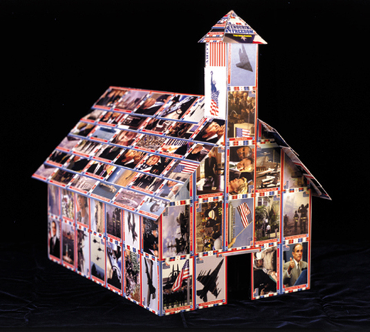
“The feeling that capitalism is perversely indomitable” 2001
Topps picture cards on wood 12 x 17 1/2 x 19
Shortly after the U.S. invasion of Afghanistan, the Topps Company issued "Operation enduring freedom" trading cards. I made them into a little temple of capitalism. This was one of the favorites in the exhibition.

“Dread” (orginal 2002, recreated for this show in 2015) Cans, labels 3 x 3”
There was a pervasive feeling at the time that there would be more attacks. As a proud New Yorker, I was certain that we were the only target that mattered. This inverted stack of cans should be toppling over but isn't. I wanted to create a feeling of uncomfortable expectations.

“The willingness to trade civil liberties for protection” 2001 Mixed media
12 x 12 x 18 1/2”
NOT IN EXHIBITION
I was at a dinner party of artists after the Patriot Act was passed by congress and they were up at arms. My feeling was whatever price our safety costs, it’s worth it and there will be enough checks and balances in place to prevent any agency of the government from abusing the powers contained in that act. I was in a small, reviled minority around that dinner table of libertarian alarmists.
Gradually, as the details of the act came to light, I saw that my Chicken Little friends were right. The act impinges on numerous civil liberties and gives the government and its agencies powers that would have our founding fathers turning in their graves.
With the Patriot Act, the Bush administration used fear to rush through sweeping diminishments of individual rights to privacy and increases to governmental snooping, even into the lives of ordinary citizens.
This piece was made from a plaster cast of an Israeli gas mask for children. It has been covered with the American Constitution and Bill of Rights.

“Fear” 2001
Acrylic on canvas, wood 58 x 56”
NOT IN EXHIBITION
I never liked flying, from the time I got to be about 30 years old. But now, the fear of being in a plane when it crashes was subsumed by the fear of being on the ground when a plane crashes into you.
I had planned to do two of these paintings, one for each of the types of planes that was crashed into the towers. A Boeing 767 and a Boeing 757. I wanted to make a painting in the style of the old warplane silhouette posters that sat at the front of the briefing rooms in World War II flying ace movies of my youth. All of a sudden, the silhouette of these passenger aircraft seemed menacing.
+ + + + + + + + + + + + + + + + + + + + + + + +
Artist's statement from the exhibition "Youth Culture in America."
There is certainly no more dynamic culture in the world today than youth culture in America. “Youth Culture in America” is an exhibition being created that will bring together and present some of the most egregious external influences our kids encounter: from television, cartoons, popular music, advertising, coloring books, peers, abusive teachers and parents, and so on. Some of them are stamped with my opinions (on issues that range from gender stereotypes to the marketing of drugs and sex to teenagers, to violence), and some of them are presented as-is, a conglomeration of both original creations and ready-mades, art and archeology.
The artworks for this show fall into three basic types: illustration and interpretive illustration (a sheet of Bevis and Butthead blotter acid; a gumball machine filled with condoms, joints, and bullets), “connect-the-dots” pieces (a child’s coloring book page superimposed over the pages from an adult’s self-help book) and macabre appropriations (the See-n-Say with explicit lyrics, the Yosemite Sam piece, and the Pin the Bullet Hole on the Schoolboy Game).
On the whole, this was a show of artistic editorials: topical, accessible and hopefully poignant.

"Yosemite Sam"2000 Acrylic on wood, lead, copper
48 x 25 x 20”
Our national handgun cartoon character. 4 feet tall.

"Heroes" 2006 Cotton/acrylic jersey
different sizes
Eric Harris and Dylan Klebold were the perpetrators of the Columbine High School massacre. To a certain swath of American youth, their fame is enviable.

"Pin the bullet wound on the schoolboy game"2001 Acrylic on cardboard, packaging
36 x 17 1/2”
Eating an ice cream and carrying American History.
+ + + + + + + + + + + + + + + + + + + + + + + +
From the "Coloring book" series and the "Vacation" show at Spike Gallery.
Artist's statement on this body of work:
For me, one of the hardest parts of making art is striking the proper balance between clarity and poetry. Creating symbolism is relatively simple; creating symbolism that’s neither too obvious nor too obscure is relatively difficult.
To this end, I have, for years, painted for that mythical person I’ve called “the thoughtful viewer,” trying to create metaphors that are neither bang-you-over-the-head obvious nor so difficult that they require my explanation to be understood.
With this body of work, I’ve found a happy middle ground, creating a series of paintings that can be deciphered without my input. The formula that allows this to happen is to simply juxtapose two elements out of which comes a third: a point of view. Here’s how I arrived at this formula.
It began with a desire to somehow incorporate some of the coloring books of my youth into a piece of art. I had a small collection of coloring books from the early 60’s and as I looked through them I was struck by how gender stereotypes were presented. The “Annette Funicello Coloring Book,” which had belonged to my sister, was all about being pretty, getting married and making a home. The “Fighting Men in Action” coloring book, which was mine, was all about masculine aggression and the cool machinery of war.
At first, I thought that simply copying selected images from these books onto a large canvas would be enough to convey meaning. But then, from either a desire to make them more “mine,” more clever, or more clear, I decided that they would work better if they were not just copied onto plain white canvas, but onto pages from meaningful books. So I found “Women and Self-esteem,” and “Anger Kills,” pulled them apart, glued their pages to the canvas, sanded them smooth and copied the coloring book images onto them. These two pieces became “Shopping for Clothes” and “Pitching a Hand Grenade”, both on the theme that gender stereotypes are reinforced from a very young age and that this is not necessarily a healthy thing.
After these first two pieces were created, I was very enthusiastic about the format: two elements in each painting; one of them defining the topic, and its juxtaposition against the other creating a point of view on that topic. It’s simple, readable, and aesthetically pleasing, and so I pursued it, creating works on other themes such as feminism (“Save Me”), environmentalism (“Silent Spring”), the desire for sexual adventure (“Delta of Venus,”), advertising (“Makes me like milk more,”) and faith ("The age of fable"). I also started considering ways to make the pieces more aesthetically interesting within the format, and you’ll see that the surfaces are varied.
The paintings in this series are fun to look at and fun to think about, and while there are precedents in Lichtenstein, Rauschenberg and Warhol, the most important precedent for me is my own art movement, the one I’ve called “funism,” whose simple tenets are as follow:
•Art should be as much fun to look at as it is to think about.
•Art should be intellectually engaging without being intellectually elitist.
•Art should invite interpretation.
Vis-à-vis these criteria, this body of work succeeds; I hope my “thoughtful viewer” agrees.

"Red Stick" 2003
Mixed media on canvas 68 x 46"
(Financial Times stock pages/Walt Disney's Pluto Pup coloring book)
On the commodification of cultural/racial stereotypes.

On the commodification of cultural/racial stereotypes.

"Save me" 2001
Acrylic on canvas 68 x 46”
(The Village Voice’s Escort Ads/”Superman” Coloring Book)
My first feminist painting.

"Circulars" 2003
Mixed media on canvas 68 x 46"
(Grocery store circulars/Elizabeth Taylor Coloring Book)
On the packaging of celebrity.
On the packaging of celebrity.
NOT IN EXHIBITION

"Silent Spring" 2001
Acrylic on canvas 68 x 46"
(Silent Spring/National Parks A Book to Color)
On our strange relationship with nature.
NOT IN EXHIBITION
On our strange relationship with nature.
NOT IN EXHIBITION
+ + + + + + + + + + + + + + + + + + + + + + + +
From the "Finding the truth" series, in which I took then president George Bush's speeches, in their unedited entirety and simply highlighted certain words to find what I thought was the truth of the matter. Political, engaging, and fun. A funism classic!

"State of the Union"

"The economy"
"Clear skies"
NOT IN EXHIBITION
+ + + + + + + + + + + +
My 'historical' markers are one of the more "serious" bodies of work I've created . . . I've watched people in Woodstock (where a few of them are on more or less permanent exhibition in the village) stop and read them and tug the shirt of their friend to stop and do the same. They deal with serious issues, yet always seem to elicit a smile. They're fun and engaging and I think are exactly what the original funism had in mind.


+ + + + + + + + + + + + + + + + + + + + + + + +
From the "Decorating nature" series:

fig. 92: certain mosses secrete a pheromone that reacts beautifully with maple leaves

fig. 15: mountain laurel with peacock syndrome.

fig. 99: a fresh bloom of the "exploding rainbow" flower.
NOT IN EXHIBITION

fig. 38: in autumn, some leaves will use color bars to help get everything perfect.
NOT IN EXHIBITION

fig. 103: occasionally, leaves fall all the way from the sky.
NOT IN EXHIBITION

fig. 118: Frequently, the last leaf to fall is the most colorful.
NOT IN EXHIBITION
+ + + + + + + + + + + + + + + + + + + + + + + +
Monsters on postcards!
Seriously fun and loads of fun to make but do they actually embody the spirit of funism? I'm gonna argue that some do and some don't. One friend claims that the monster post cards "offer interesting intellectual commentary on sentimental mementos..." Maybe it's a question of intention? For me, I was just trying to have fun. Paint something whimsical. Sometimes something of the commentary slips in anyway, but still. These, for me are not funism, but certainly illustrate an interesting thought: maybe funism is in the eye of the beholder!

"Here, birdie, birdie." Watercolor on postcard

"Alien with crab claw" Watercolor on postcard

"Four on the floor" 2013 Watercolor on thrift store print
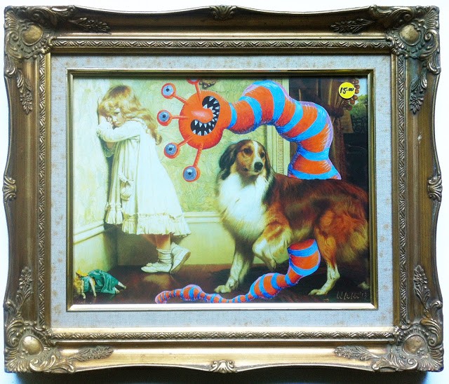
"Man's best friend" 2013 acrylic and watercolor on thrift store print

"Forbidden fruit" 2013 watercolor on thrift store print

"Green boy" 2013 Watercolor on thrift store print, framed size 12" x 9”

"Just south of South of the border" Watercolor on postcard
NOT IN EXHIBITION

"Cooper Lake quartet" Watercolor on postcard
NOT IN EXHIBITION

"Undercover bridge" Watercolor on postcard
NOT IN EXHIBITION

"Eiffel terror” Watercolor on postcard
NOT IN EXHIBITION
"Here, birdie, birdie." Watercolor on postcard

"Mill house monster" Watercolor on postcard
NOT IN EXHIBITION
+ + + + + + + + + + + + + + + + + + + + + + + +
A one-off:
For me, this is piece is, perhaps, verging on being a little too esoteric to be funism, but it raises a question that I've wrestled with for as long as I've been making visual art: do I want to have wall text next to the work? Is a work that needs explanatory text less good than a work that doesn't? Norman Rockwell's paintings certainly didn't need any explanatory text, the viewer just gets them. Same with Mark Rothko: the viewer just feels them. This piece, "GHOTI" doesn't need the explanatory text, but the text certainly enriches the experience. Hopefully, even without the explanation, viewers will see this and it will invite interpretation rather than rebuffing it. Making it a funism work after all.

“Ghoti” 2014
Archival digital print (32 x 32")
"Ghoti" is an interesting word construction that illustrates some of the inherent difficulties of the English language. I was making a study for a new painting and loved the digital study so much that I decided to make a print of it. It's gorgeous. The painting will be done soon.
For more information on "ghoti", click here.
+ + + + + + + + + + + + + + + + + + + + + + + +
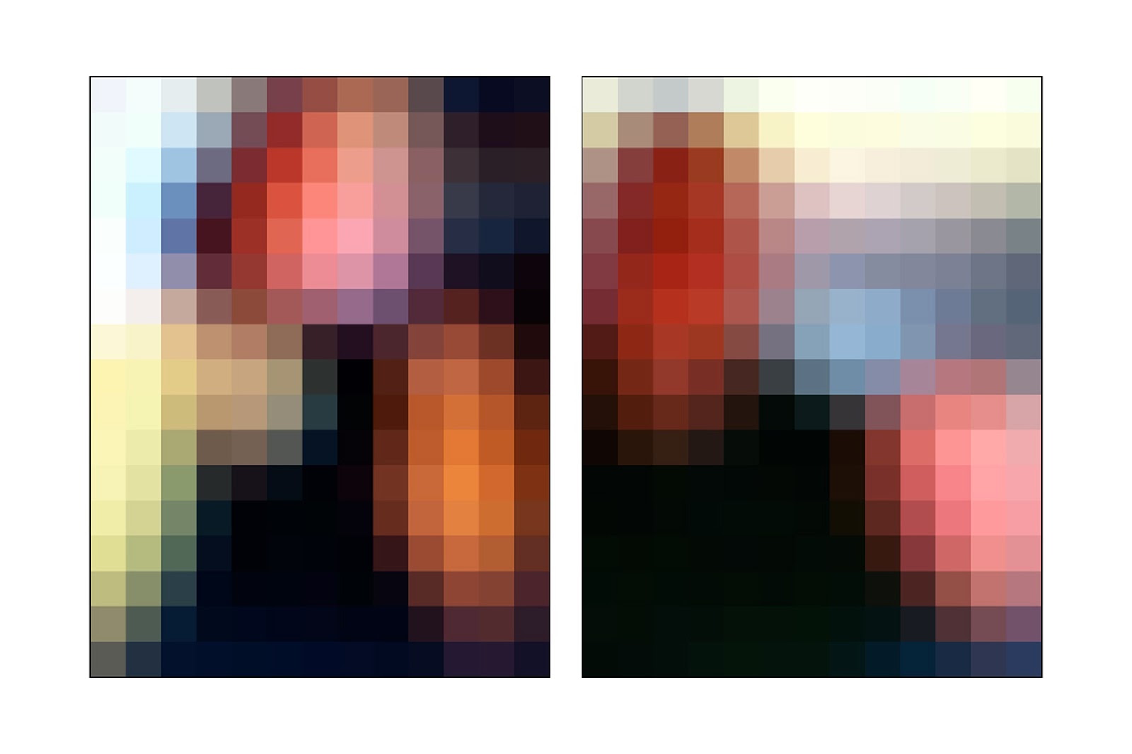
From my "Proximity and distance" series:
(the entire series can be seen here.)
Whereas "GHOTI" teeters on the edge of needing explanation to be understood and enjoyed, the "proximity and distance" series, in my opinion, does not. From a distance, they gain resolution....
The internet is a great forum for bringing people together. It is also, by nature of how we use it, a great isolator -- creating an ersatz society where we can enjoy each other’s company from the privacy and solitude of our own homes. It provides proximity from a distance and allows us to filter our personas through its fun house mirror, presenting to the world only the images we have chosen.
On Facebook, there’s no more manicured presentation of our best face forward than our “profile picture.”
For “Proximity and distance”, I placed my iPhone right up against my computer screen, resting it in the hinge of my laptop. I scrolled each 50 x 50 pixel profile picture into position and snapped the photo, the mechanics of the act restating the very theme of this series. I then brought these blurry photos into Photoshop and further decreased their resolution by making each one a mere 13 pixels across. At this point, I enlarged them as much as I could (3200%, up to 418 pixels across), and took a screen grab of them at that size.
Finally, echoing the social nature of Facebook, I paired them with other pics that felt right with them due to color or composition or some other factor.
This series presents the paradox of social media in all its colorful, amorphous glory. The photographs range from recognizable (person on a horse) to completely abstract; they are, at once, familiar and unfamiliar and, like the people behind them, they evoke emotions ranging from soothing to disturbing to haunting.

"Unknown and Jessica" 2015
Archival computer print

"Patty and Zoe" 2015
Archival computer print

"Kimberly and Monica" 2015
Archival computer print
"Shelly and Karen" 2015
Archival computer print
+ + + + + + + + + + + + + + + + + + + + + + + +
A one-off piece created on the computer, thinking about our landscape then and our landscape now. The pretty green landscape is a Thomas Cole painting, the smokestack belching pollution is from Google images. For me, this is a perfect funism piece: it's pretty, its message is accessible and decipherable by any thoughtful viewer.

"Pess/Op" 2006
Archival computer print
Below: installation views of this exhibition at SUNY/Ulster


+ + + + + + + + + + + + + + + + + + + + + + + +

"Untitled" 1990/1999
Decollage
NOT IN EXHIBITION

"Untitled" 1990/1999
Decollage
NOT IN EXHIBITION

"Untitled" 1990/1999
Decollage
NOT IN EXHIBITION

"Untitled" 1990/1999
Decollage
NOT IN EXHIBITION
+ + + + + + + + + + + + + + + + + + + + + + + +
Landscape details
My friend Grace said that she didn't want any art on her walls and went on to say that if she was going to have any art on her walls, she'd want a large canvas that was only blue. That was the beginning of this idea, to take details out of the landscapes that I had been painting, put each detail on its own canvas, hang them together and call it art.
These pieces here are watercolor studies for the real pieces, only one of which was ever made. It turned out awesome, I gave it to Ned and Theresa for a wedding gift.

"Blade of grass" 1993 Watercolor on paper
NOT IN EXHIBITION

"Haystack" 1993 Watercolor on paper
NOT IN EXHIBITION

"Landscape detail #5" 1993 Watercolor on paper
NOT IN EXHIBITION

"Landscape detail #7" 1993 Watercolor on paper
NOT IN EXHIBITION

"Olive tree over the pool" 1993 Watercolor on paper
NOT IN EXHIBITION

"Plowing under the sky" 1993 Watercolor on paper
NOT IN EXHIBITION

"The desert through my window" 1993 Watercolor on paper
NOT IN EXHIBITION

"The road through the desert" 1993 Watercolor on paper
NOT IN EXHIBITION

"There's a cactus out my window" 1993 Watercolor on paper
NOT IN EXHIBITION

"3 fields under the sky/dolmen" 1993 Watercolor on paper
NOT IN EXHIBITION

"Tire tracks in the field" 1993 Watercolor on paper
NOT IN EXHIBITION

"Under the apple tree" 1993 Watercolor on paper
NOT IN EXHIBITION

"Underneath the big oak tree" 1993 Watercolor on paper
NOT IN EXHIBITION
+ + + + + + + + + + + + + + + + + + + + + + + +
Early reviews of my new art movement:
The second review of 'funism'. The Village, Sept. 9, 1992

A review of my show at the Springfield Art Museum in 2000.

Another review of my 'funism' art, from 1996.

+ + + + + + + + + + + + + + + + + + + + + + + +
Reviews of "Funism" exhibition:

